


Overview
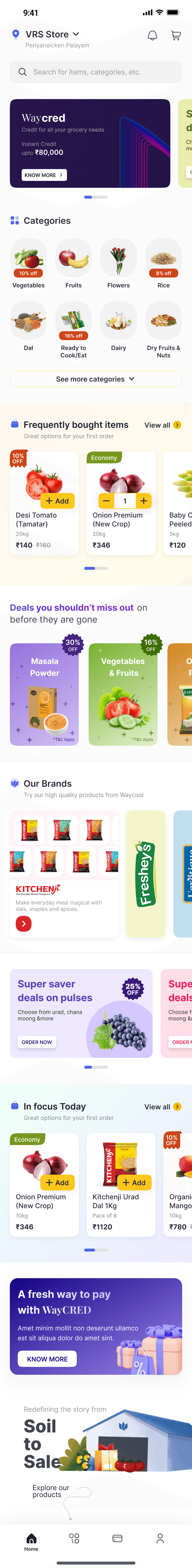
Despite being India’s largest agri-tech player, WayCool’s B2B ordering app was struggling with low adoption, fragmented user journeys, and high dependency on offline sales—making it critical to redesign the experience for kirana store owners, restaurant managers, and hotel buyers who needed a faster, clearer, and more reliable way to place repeat orders in their local language, without friction or guesswork.
Timeline
5 weeks
from explorations to final designs while working with multiple projects at the same time
Team
Product Manager
Product Designer
Graphic Designer
Engineering Manager
lEAD PRODUCT DESIGNER (ME)
My Role
As the Lead Product Designer at Waycool, I spearheaded a complete redesign of the mobile app to support kirana store owners, restaurant managers, and procurement teams — building a solution that’s intuitive, regional, and resilient for India’s real-world constraints.
What Wasn’t Working (and Why It Mattered)
User Problems
Broken Discovery
Users relied on SKU codes to place orders — no visual browsing, no exploration.
No Smart Reordering
Reordering lacked personalization or memory of past purchases.
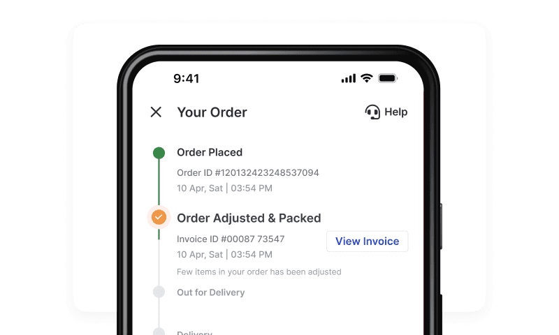
Poor Order Tracking
Users were confused by vague statuses and heavily dependent on customer support.
Unintuitive Experience
The app felt inconsistent and clunky — especially for new or low-tech users.
Business Problems
High Support Load
Basic queries (like finding products or tracking orders) led to unnecessary support tickets.
Low Repeat Order
Friction in the flow discouraged reordering from regular users.
Procurement Gaps
No support for large-volume or recurring orders — especially for hotels and restaurant clients.
Lack of Insights
Scattered data and disconnected flows meant no clear visibility into user behavior.
Impact at a Glance


21%
reduction in cart abandonment, cart completion rate went up from 73.3% to 89.7%
51%
of total orders through the app (first month), 12,022 out of 23,687 total orders
72% of customers placed multiple orders within 30 days
Average of 3.4 orders per customer after migration
63%
reduction in ordering time for new users
19.28%
of total order value through app more than doubled from 7.4%
42%
increase in app based orders from 23% to 65%
90%
customer migrated to new platform within 30 days
85%
Product discovery success rate improved from 10% to 85%
Order errors reduced by 78%

Add
Price
₹570
₹650
10%
OFF
Organic Paneer 200g -
(Set of 5)
₹570
(₹120/Pcs MRP:₹130)
10% + 5% Profit margin
Onion 45MM 49KG - Pack
₹920/Pack
₹1038
Buy 5 Packs at ₹920/Pack
Buy 10 Packs at ₹850/...
2 more

5
Price
₹5,190
Chilli Green India 3.8kg - Box (Set of 10)
₹1,840 (₹184/Pack)

Economy

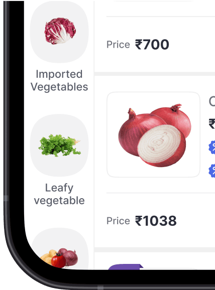
All

Cut Vegetable

Exotic Vegetable

Fresh vegetables

Imported Vegetables
Designing for Waycool wasn’t just about UI — it was about deeply understanding the on-ground realities, internal workflows, and tech limitations of a diverse user base. Here’s how we approached it:
Here's how we approach it:
We kicked off the project by interviewing key stakeholders across sales, operations, and tech to understand internal workflows, pain points, and business goals. This phase helped us map the broader supply chain challenges and align on what success would look like for both users and the business.
We conducted immersive field research across three Indian states, riding along with sales agents and spending time in kirana shops, restaurant kitchens, and hotel procurement offices. Through contextual inquiry and interviews, we identified behavioral patterns, cultural nuances, and real-world workarounds that shaped our approach.
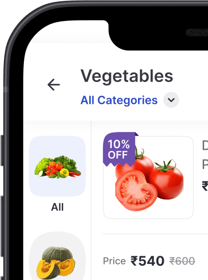
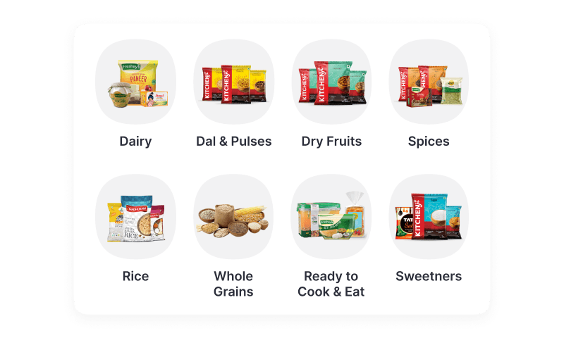
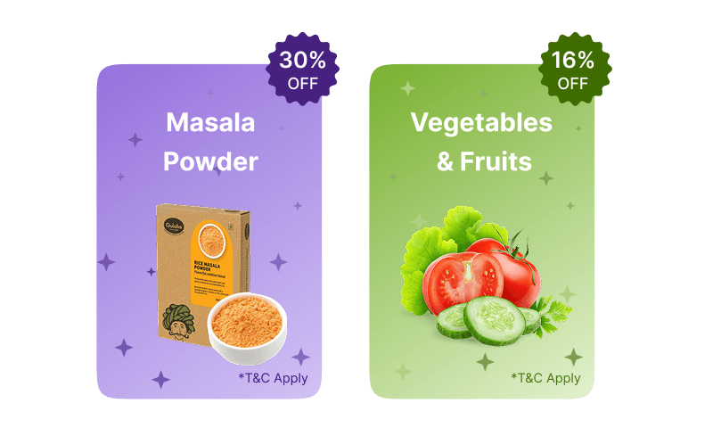
We redefined the app’s navigation from the ground up — introducing product categories, intelligent search, regional filtering, and clear ordering flows. Our new IA was grounded in user mental models and tested via early prototypes with internal and external stakeholders.
We created low-fidelity wireframes to explore and validate core user journeys like browsing, reordering, and tracking deliveries. These were turned into interactive prototypes and tested with actual users in their native environments to ensure clarity, speed, and ease of use.
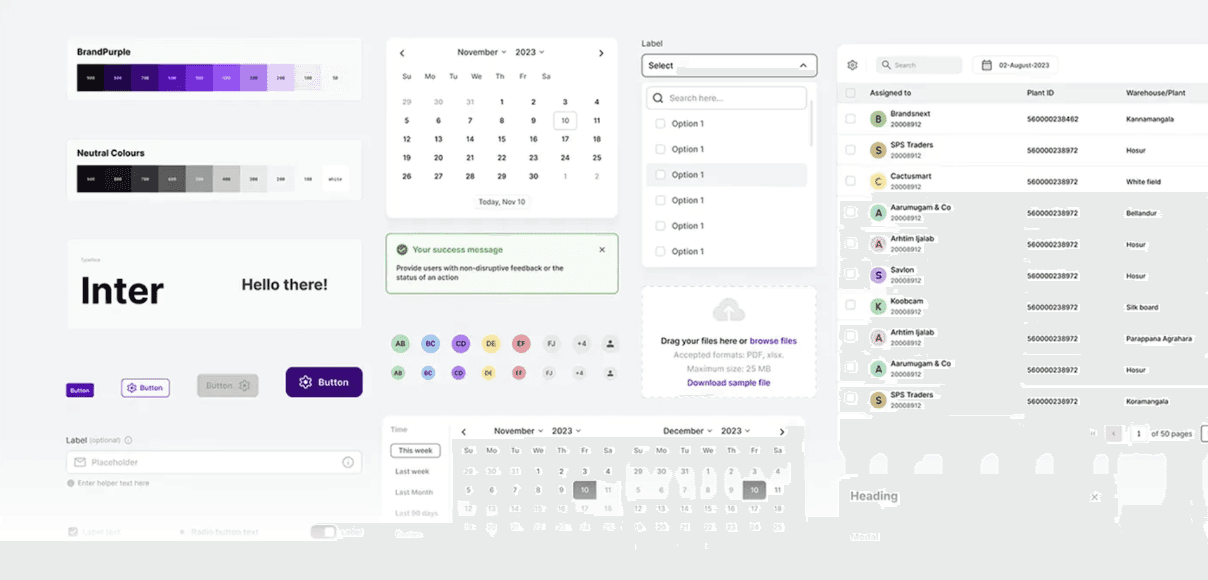
We designed a modular, scalable UI system with accessibility and localization at its core. Fonts, iconography, and contrast were optimized for legibility and regional relevance. Subtle animations and microinteractions were added to enhance feedback, delight, and trust.
We worked closely with developers through Zeplin handoffs and live walkthroughs to ensure design fidelity. Detailed documentation was created to support QA teams, and we remained embedded through implementation to resolve edge cases and support future iterations
"We didn’t just sit behind screens. I rode with our salespeople through narrow market lanes, stood shoulder to shoulder with kirana owners as they browsed dusty product catalogs, and sat in the back rooms of restaurants listening to managers juggle inventory and delivery schedules.
I spent time with hotel procurement teams, watching how they navigated spreadsheets, WhatsApp orders, and supplier calls — all to understand how our app needed to fit into their real-world routines, not the other way around."
Shadowed salespeople across 3 states
Interviewed 20+ users across kiranas, restaurants, and hotel procurement teams
Synthesized findings into personas and journey maps


Key Insights
From our research, four key themes emerged…
• Heavy reliance on visual memory and repetition.
• Only 1 in 10 users could find what they needed without help.
• Low confidence in digital ordering due to past app failures.
• Users preferred calling sales reps over using the app.
• Local language preference was high.
• Users struggled with navigation in English-based interfaces.
• Users didn’t recognize product quality until sales reps explained it.
• New users spent 63% more time placing orders than returning ones.


Empathize with low-tech, multilingual users
Adapt interfaces to varying digital fluency levels
Validate assumptions with real user feedback
Bridge the gap between assumption and reality
Align early with devs and PMs to untangle complexity
Build shared mental models from the start
Design flexible components for multiple user archetypes
Scale UX without sacrificing simplicity
Curious to dive deeper?