As Product Design Lead at Censa, I led the creation of a unified design system to support our rapidly growing suite of 15+ B2B applications. With multiple user personas and distributed teams, our design ecosystem had grown fragmented and inefficient.
To scale effectively, we needed more than a visual refresh—we needed a system that enabled teams to move fast, build consistently, and deliver intuitive, accessible experiences.
This case study shares how we transformed a scattered environment into a cohesive, developer-friendly design system that drives consistency, reduces engineering overhead, and accelerates time-to-market across Censa’s entire product suite.
As Product Design Lead at Censa, I led a strategic initiative to transform our fragmented design ecosystem into a scalable, systematized foundation for 15+ B2B products. I worked across product, engineering, and business leadership while directly managing a 16-person design team and a 3-person research team.
Core Team Breakdown
1 Product Design Lead
Owned system architecture, governance, and documentation standards
3 Product Designers(core)
Focused on building and maintaining the Figma library + Storybook components
11 Product Designers
Applied the system in live products and contributed use-case feedback
1 Lead UX Researcher + 2 UX Researchers
Validated design hypotheses, guided usability testing, and ensured user-centric decision-making across the system
Cross-Functional Team
Product Managers
Ensured roadmap alignment and prioritized areas for system rollout based on product needs and business goals.
Engineering Leads
Collaborated closely on integrating the design system into Storybook and aligning coded components with Figma.
Business Stakeholders
Played a key role in resource planning and leadership buy-in, helping position the system as a business enabler.
My Focus as a Design Leader
I structured the initiative around practical adoption, embedding contributors within product teams while carving out bandwidth for system work. This ensured the system was both aspirational and grounded in day-to-day product needs.
Drove collaboration across design, product, and engineering.
Embedded contributors into product squads for real-time feedback and rollout.
Defined governance, documentation, and review processes.
Mentored designers, drove critiques, and led workshops to refine process.

As Censa’s platform scaled to over 15 products, our once-flexible design approach began to show its limits. What started as isolated design decisions eventually led to systemic inefficiencies across the product suite.
Multiple teams followed their own visual styles
No single source of truth for UI patterns
Brand consistency broke down across apps
Only ~45% of designs translated accurately into code
Devs rebuilt components from scratch
Frequent rework cycles caused delays and friction
No design tokens or modular components
Scaling risked breaking consistency
No accessibility foundation for global rollout
Designers duplicated similar work across teams
Devs and QA struggled with inconsistent specs
Increased alignment cost across squads
Before a single component was built, the real challenge lay in aligning stakeholders across engineering, product, and business leadership.
As Product Design Lead reporting to the CEO, I positioned the design system not as a UI upgrade — but as a strategic enabler of velocity, consistency, and scale.
Here’s how I addressed key concerns through tailored narratives, case studies, and strategic framing:
Primary concern: Hesitation to commit bandwidth to maintaining a design system.
I demonstrated how Storybook integration could reduce frontend rework by ~30%, citing case studies from Shopify Polaris and IBM Carbon.
I also referenced McKinsey’s Business Value of Design, which links design maturity to measurable engineering efficiency.
Primary concern: Fear that standardization would limit creativity and slow product releases.
I led a targeted effort to counter this perception. Using case studies from Shopify Polaris, IBM Carbon, and data from Material Design and McKinsey, I showed how structured design systems improve usability, support innovation, and accelerate release cycles.
This reframed systems not as constraints — but as growth accelerators.
To move from opinion to evidence, I supported our proposal with industry-backed impact metrics demonstrating the ROI of a design system.
To substantiate our proposal, I presented metrics from authoritative case studies and industry research, highlighting the tangible benefits of implementing a design system:
🔍 Referenced Case Studies & Articles (links included)
To support our case and align stakeholders across functions, I curated a selection of credible resources that illustrate the strategic and operational impact of design systems:
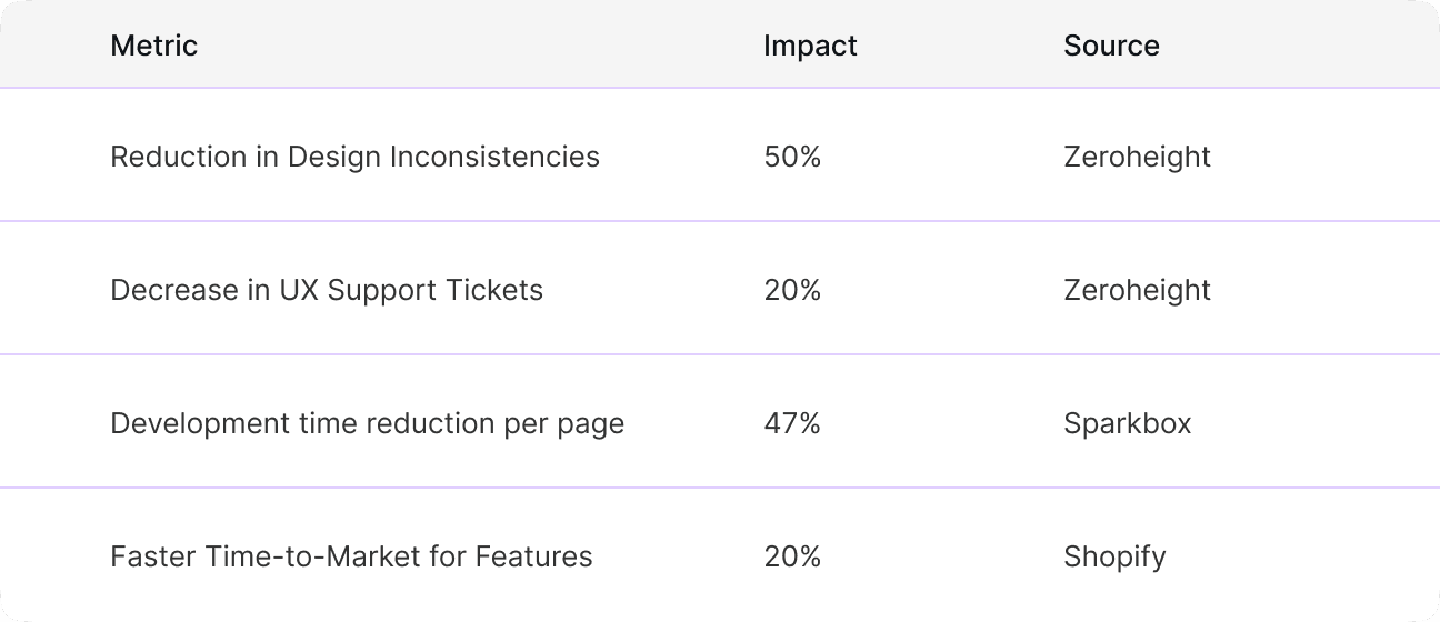
Calculating the ROI of Your Design System – Zeroheight
Breaks down the business value of design systems using real-world metrics like reduction in design inconsistencies and support tickets.Design System ROI – Sparkbox
Analyzes IBM Carbon’s design system and highlights how it accelerated time-to-market by 47%.Design Systems: Enabling the Speed of Innovation – InVision
Offers deep insights into how design systems drive consistency and unlock rapid iteration across distributed teams.Airbnb Design System Case Study – IRJET
A technical overview of how Airbnb’s system helped reduce development time per page by up to 30%.The ROI of UX – Ramotion
Outlines the broader impact of good design practice on business growth, customer retention, and reduced churn.
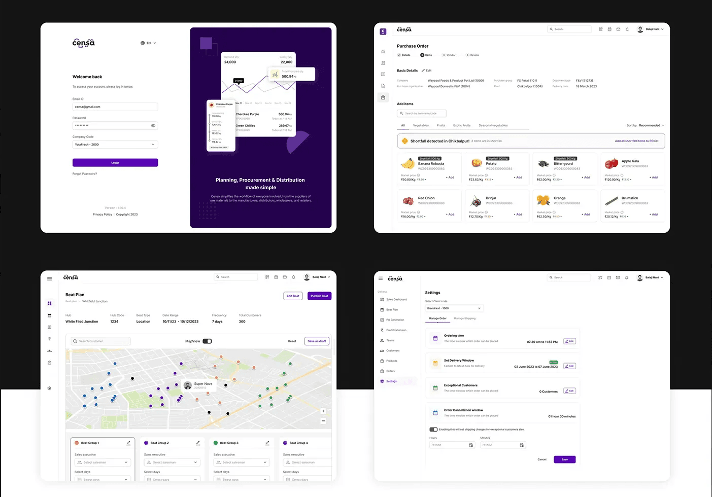
How We Built It: Our Approach
We treated the design system as a strategic foundation — built to scale, grounded in research, and refined through iterative validation.
From day one, we prioritized accessibility, visual clarity, and performance — not just for our current footprint, but to support global expansion across Europe and Africa.
Research-Led Foundation
Our Lead UX Researcher and 2 UX Researchers were embedded throughout:


On-ground research visuals: capturing context, pain points, and user routines
Design System Architecture
The “what we built” — structure and systems
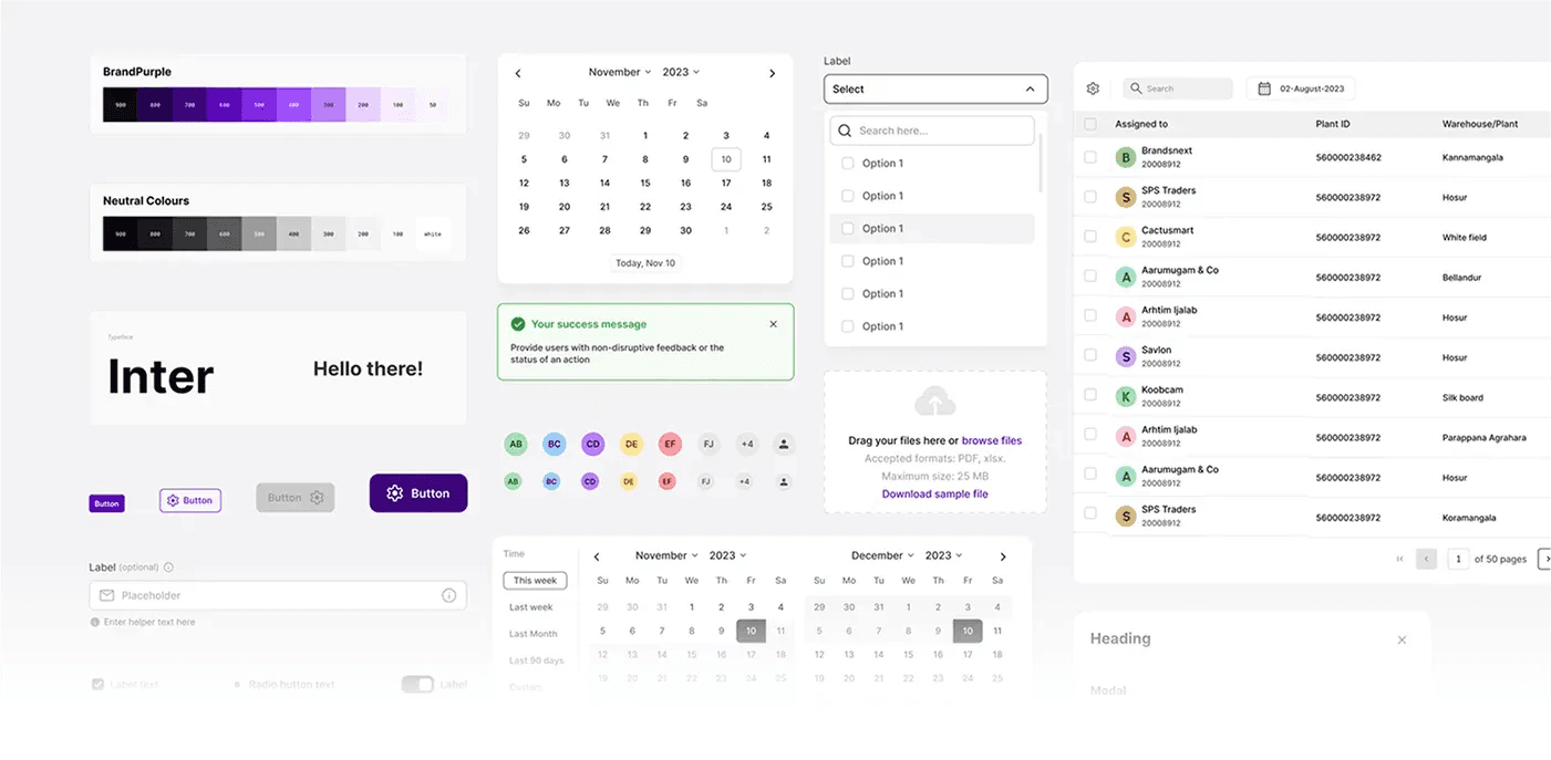
Consolidated typography, spacing, color, and iconography
Standardized UI expression across dashboards, workflows, and transactional apps
Balanced consistency with flexibility for different use cases
Built a platform-agnostic token system via Tokens Studio
Structured semantic tokens for themes, accessibility, and multi-brand support
Ensured WCAG-compliant contrast ratios for global readiness
Enabled seamless dark mode and adaptive UI styling
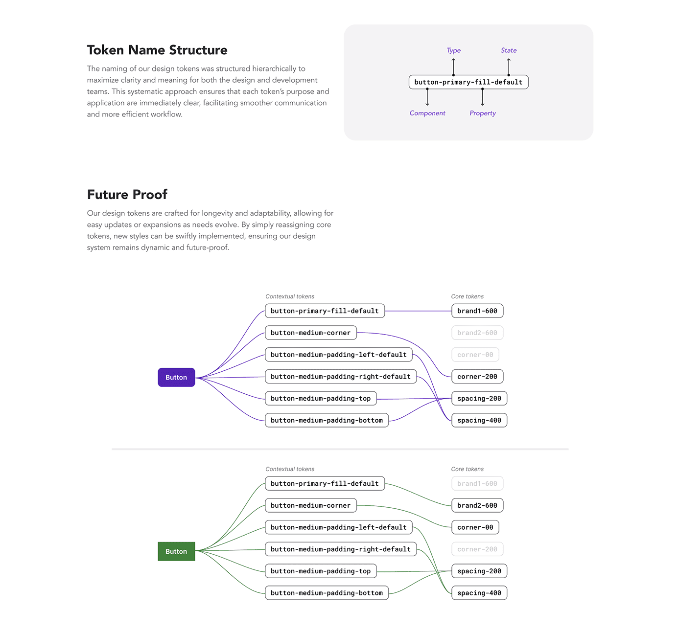
Nomenclature for design tokens
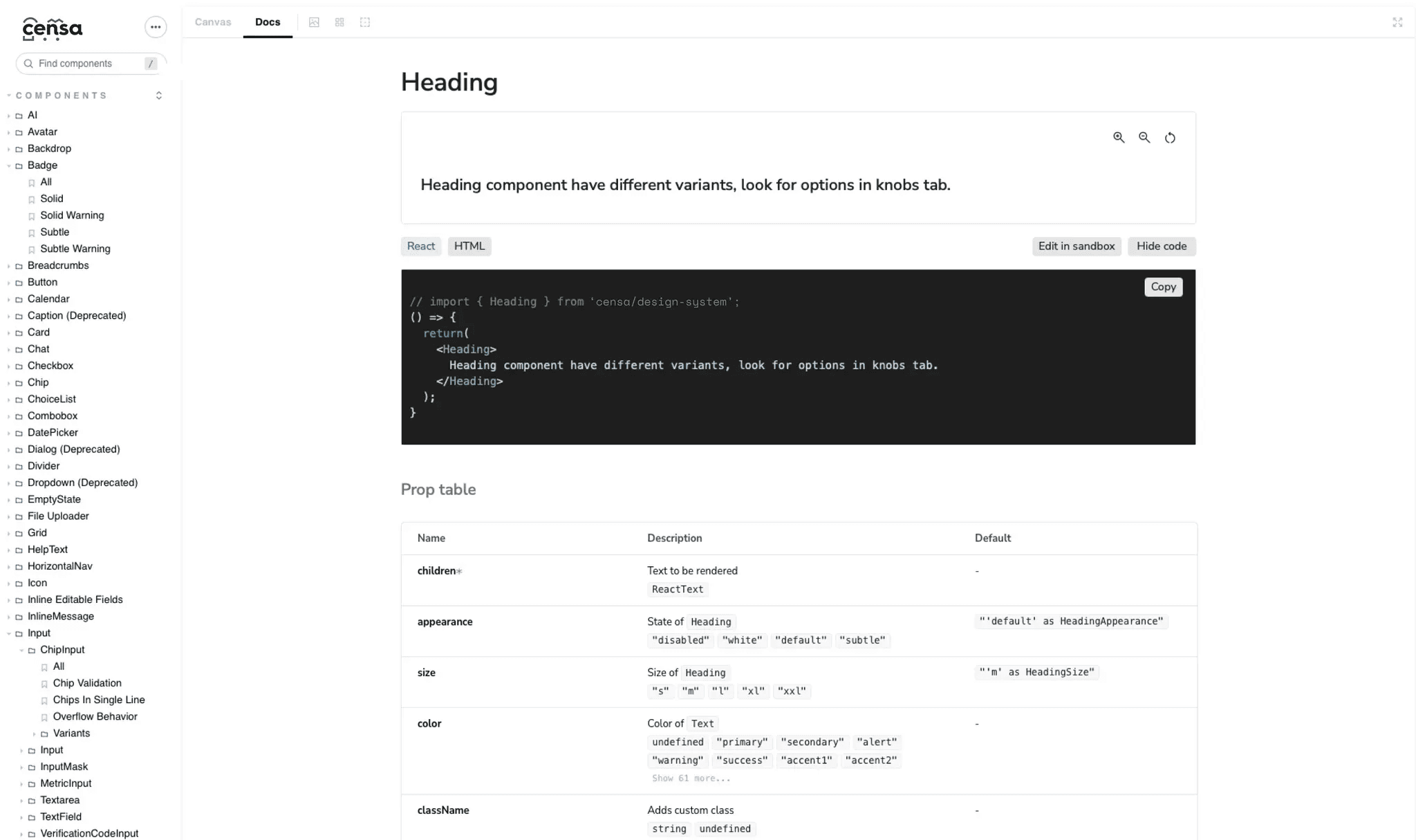
Designed 100+ reusable Figma components with edge case support
Focused on semantic HTML, keyboard nav, screen reader compatibility
Every component was tested and documented to support adoption and accessibility
Accessibility wasn’t a checklist — it was baked into how we built from the start
Demo of different states of our table component
System Enablement & Adoption
The “how we built and scaled it” — enablement, testing, rollout
Built a parallel React component library in Storybook with the frontend team
Enabled real-time alignment between design and code
Documented props, usage guidelines, and variants
Achieved 85%+ design-to-dev parity across production teams
Coded components in Storybook
To align on system aesthetics, we ran a series of focused workshops within the design org:
Built a platform-agnostic token system via Tokens Studio
Structured semantic tokens for themes, accessibility, and multi-brand support
Ensured WCAG-compliant contrast ratios for global readiness
Enabled seamless dark mode and adaptive UI styling

A/B tested layout variants, color pairings, and information hierarchies
Used heatmaps, surveys, and completion metrics to drive decisions
Finalized three system principles:
Clarity over cleverness
Performance through consistency
Modularity without rigidity
Our system wasn’t just built — it was discovered, through research, testing, collaboration, and iteration. Accessibility and scalability were not features — they were the foundation.
Designing a system was one thing — scaling it without chaos was another.
Rolling out the design system was a milestone. But what followed was even more critical: building a scalable process for contribution, QA, and developer alignment.
Without this, we’d risk drifting back into silos, misalignment, and design-code discrepancies.

The Challenges We Faced
Issue tracking was scattered — feedback lived across Slack, FigJam, and Jira, with no clarity on priority or ownership. Bugs lingered unresolved or fell through the cracks.
One-off components crept in due to lack of clarity on what already existed
Teams were unclear about decision rights and ownership of updates
Even with Storybook in place, Figma-to-dev alignment started drifting
How we fixed it
To eliminate confusion and enable cross-functional clarity, I led the creation of a systematic workflow that guided every component from idea → to implementation → to improvement.
This framework made the design system a living product, governed by process—not just files.
The 4D Lifecycle:

1. Design (Figma → Mockups & Variants)
Designers branch and create components with all necessary states and edge cases
Early syncs with developers to flag feasibility issues
Initial documentation created in Figma (props, variants, accessibility notes)
2. Decision (System Entry Criteria)
A clear decision tree:
Does this component already exist?
Does it scale across products?
Is it a new addition or a modification?
If valid, task gets added to the design system board with scope and rationale
Discussions documented around governance, alternatives, and ownership
3. Develop (Storybook Build)
Developer builds sandbox version
Design QA happens against the live coded component
Accessibility, animation, and responsiveness tested
Final specs and links added to documentation hub
4. Deliver (Publish & Notify)
Components published to the live library and design kit
Team notified with usage guidelines and links
If part of a larger system (e.g. forms, tables), subsystems flagged for update
Every step had built-in checkpoints and questions — from “Who needs to be notified?” to “What’s our design QA process?”
Continuous Feedback Loop
This system isn’t static — we designed it to evolve.
UX researchers continuously tested real-world usage patterns post-launch.
Team feedback was actively collected to identify gaps and bottlenecks.
Workflow improvements were rolled out quarterly, based on what teams needed.
This structured system turned the design system into a living product — supported by process, not just files. It helped us minimize duplication, maintain quality, and evolve fast — without chaos.

Bringing the 4D System to Life
System in Action
Beyond principles — here’s how we operationalized our design system to keep teams aligned and components consistent.
A single go-to place for designers and devs to report bugs, clarify doubts, and align on system updates.
Every bug or suggestion logged in a shared sheet with a status checklist for ownership and consistency.
Design and code updates were kept in lockstep — Figma and Storybook stayed version-aligned.
Real-time visibility into component progress across teams helped prevent silos and miscommunication.
The design system wasn’t just a toolkit — it became a force multiplier across design, development, and product.
And we did it in just 3 months.


The numbers told the story: we weren’t just designing faster — we were designing better.
Looking back, this initiative wasn’t just about building a design system — it was about building alignment, habits, and momentum across teams.

Design Systems Are as Much Cultural as They Are Technical
Tools and tokens alone don’t unify teams — shared understanding does. We spent as much time building trust and clarity as we did components.
Governance Must Be Light, but Strong
Early on, we avoided over-process. But without clear ownership, things broke down. Lightweight rituals (like audits, changelogs, and contribution reviews) gave the system structure without
Aesthetic Choices Must Be Tested, Not Assumed
Through internal workshops and A/B testing, we found that elegance doesn’t always mean minimalism, and that scalable design starts with user-contextual exploration, not just trends.
Scaling Requires Letting Go
I stepped back from micromanagement by codifying principles, creating reusable patterns, and empowering the team to evolve the system through contribution.

Cross-functional Alignment from Day One
We involved engineers, PMs, and researchers from the start — not just in execution, but in shaping what the system needed to be.
Iteration over Perfection
We treated the system like a product — shipped small, validated often, and let the usage shape the roadmap.
Focus on Real Impact, Not Just Pixel-Perfection
Every decision was tied back to improving product velocity, UX consistency, or developer efficiency — this focus kept the team energized and the stakeholders on board.